Titanic Movie Poster (CRAP Analysis)
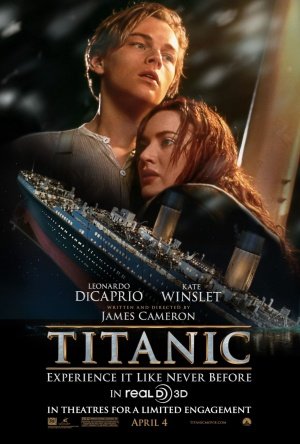
To evaluate a poster based on the CRAP principles, I have chosen the poster of my favorite movie, Titanic.
Contrast:
>The dark background makes Jack (Leonald Dicaprio) and Rose (Kate Winslet) stand out.
>The overall darkness of this poster indicates the tragedy the characters will be facing throughout the movie.
Repetition:
>Words written in the poster use the same font.
Alignment:
>The words are all lined up in the bottom center of the poster.
Proximity:
>The names of the actor and actress are in the same size, differentiating themselves with the other information.
-----
In order to make this poster more eye-catching and convincing, I think it would be better to make improvements in the contrast by writing the title of the movie much larger or in a different font.


Aww ♡ It's no surprise you chose Titanic! It truly is one of the classics. I like how the Titanic is in the center and is below Leonardo DiCaprio and Kate Winslet. I think it emphasizes that the story resolves more around the two people above! :)
返信削除